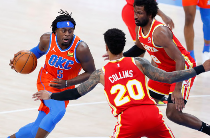
Atlanta Hawks, Oklahoma City Thunder. (Mandatory Credit: Alonzo Adams-USA TODAY Sports)
A collective jersey debacle made the first half of the Atlanta Hawks vs. the Oklahoma City Thunder game on Friday night completely unwatchable.
The Atlanta Hawks and the Oklahoma City Thunder proved to the world once again that red uniforms and orange uniforms do not mix under any circumstances.
A uniform scheduling mix-up had the Hawks in red and the Thunder in orange on Friday night. Because Atlanta only traveled with its red jerseys to Oklahoma City, the Thunder had to switch to white at halftime. Though the Thunder won the game decidedly, 118-109, let this be a lesson for those who have never looked at a color wheel to, I don’t know, look at a color wheel ….
Warm colors are great, but not together on a basketball court
While I am not a visual artist by any means, as I prefer words and music to express myself (okay, I can’t draw worth a damn!), I know that you cannot place red and orange next to each other and think that is going to be visually appealing. My younger sister does interior design for a living, so by blood, I have learned what a color wheel is and why it is important: To avoid this nonsense.
Let’s be real. When the Hawks and Thunder players went out to center circle for the opening tipoff, they had to know that they looked absolutely ridiculous wearing colors too close for comfort. You know, back in the day, orange was not even a color. It was an extremely light shade of red that smarter people than us named after the delicious citrus fruit. Those people died in vain after this.
Unless you are making fruit salad, avoid putting things that are red next to things that are orange.